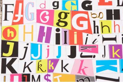
Good Letters
For a professional online presence, here’s what to avoid when selecting brand fonts.

 The brand fonts you choose for a logo, web copy, or packaging design can say as much about your business as your product or customer service. Insight of design is a powerful tool and should be exercised with extreme care and attention to detail. Selecting the right brand fonts can, believe it or not, enhance your trust and awareness among your audience—but selecting the wrong ones can be detrimental to your brand.
Here is what you should consider.
Avoid fonts that don’t belong to a font family. When selecting a font for your logo, your website, or brand materials, it’s always wise to opt for one that belongs to a larger family of fonts. What does this mean? A typeface is a collection of fonts that vary in different weights, styles, and sizes, yet they’re all part of the same design and aesthetic. Each font in a family is related and allows you to introduce contrast to the applications you use them for without breaking consistency.
Take the popular typeface Helvetica, for example. This family consists of fonts that vary in weight and style. From Helvetica Bold to Helvetica Light, having a family makes it easier to keep your brand applications looking polished, professional, and uniform.
Avoid similar typefaces when choosing a complementary font. After selecting a typeface that reflects the personality of your brand, choosing a complementary font should be your next step. When pairing fonts, your goal should be to find one that works well with the primary font while still providing plenty of contrast.
For example, if the primary font you’ve selected is a serif font (one that has small lines or “feet” at the edges of the characters), you’ll want to select a sans serif (without the feet) as your secondary font. It’s rare, if ever, that two serif fonts can work together—it’s just too much going on. Sans serifs are typically easier to read on a screen and contribute to a clean and modern look.
Avoid using multiple fonts. While using one or two different fonts in a brand application is encouraged, anything more can end up working against your goal. You want your font selections to enhance your message, not clutter it up. Using more than one font helps create contrast, however, using three or four can appear distracting, confusing, and unprofessional, as each competes for attention. Of course, there are exceptions to every rule, but it’s a good rule of thumb to stand by.


