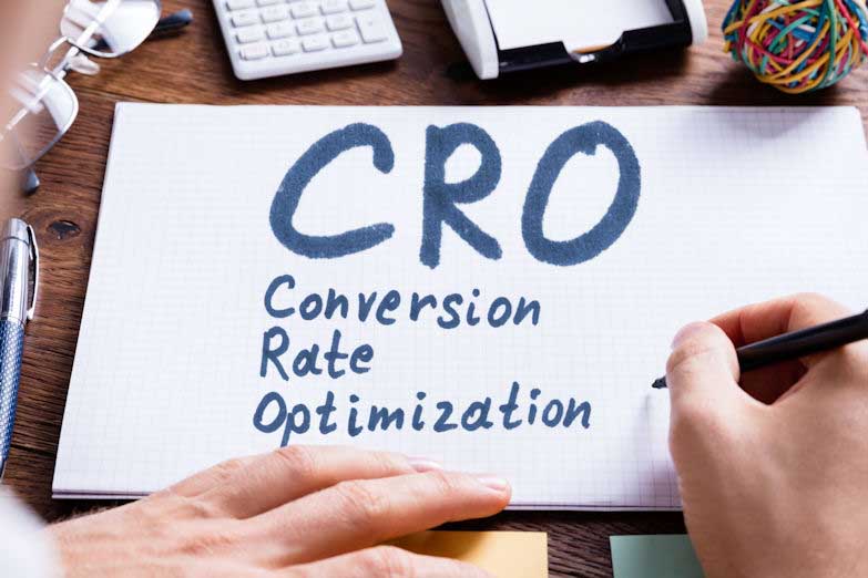
CRO: Conversion Rate Optimization
Here are three ways to improve conversion rate optimization.

There are multiple stages of conversion rate optimization. And like a revolving door, optimization of your website is something that never ends as your brand expands, grows, or changes. Improving your current conversion rate optimization game should begin with a careful audit. The following three tips will help you analyze existing landing pages on your site and inform the construction of new pages as they are added.
#1: Landing Page Design
It takes just 0.05 seconds for visitors to form an opinion about a landing page, and with so little time, it’s imperative your page design is attractive and easy to navigate. If it’s not, you could be losing out on potential customers (and no one wants that!). The visual elements and layout of a landing page are some of the first things that make an impression and influence a visitor’s opinion and likelihood to follow the conversion funnel.
We suggest organizing the content on your landing page with what we refer to as an inverted pyramid. The most important, eye-catching content and call-to-action (CTA) should live at the top, and as you scroll, the more expository and detailed you can get with product or service information.
In the top portion of your page, make messaging and CTAs simple. If a visitor wants more information before they make a purchase, book an appointment, or schedule a service, they can scroll down and quickly find that information.
To further improve conversion rate optimization of your landing page design, ensure any photos or visual elements on the page are sharp and of high quality. Consider animating select elements on the page to further draw the focus in and capture your visitors’ attention.
#2: Website Copy
After the visual and navigational impression sinks in on your visitor, your landing page copy becomes an immediate focus. From headlines and body copy to formatting and writing style, every element is an opportunity not only inform but also to influence your potential customer.
Consider the legibility of the font, size, spacing, and color you select for your landing page. Is it easy to read? Is it attractive? Do the font and color reflect your product and brand?
How about the writing style, voice, or tone you employ? Is your brand’s tone serious? Fun? Is it casual? Always write with purpose and keep your customer and your brand image in mind when determining the appropriate tone to use in your language.
Writing compelling website copy is all about understanding your product, your audience, and your brand. And from that point, using language as a tool to magnetize your visitors to the CTA you want them to follow.
#3: Call-to-Action
Determining the right call to action for your landing page may hinge on your brand’s tone, vertical, product, service, or audience. And when it comes to creating effective call-to-actions, sometimes simple says it best.
You want your audience to know exactly what to do, and you want them to act now. Using clear action verbs can help improve conversion rate optimization and influence users to take action now and not wait. And whether you want your visitors to purchase a product, subscribe to an email list, test a software trial, download a whitepaper, or request more information, using simple command words leaves little room for confusion on what a visitor can expect when they click a button on your page:
• Shop Now
• Place Order
• Get a Free Quote
• Try Free
• Sign Up Free
• Download Now
In addition to using clear, concise language in a portion of your CTA, utilizing both emotion and FOMO, or the fear of missing out, in the lead up to your CTA button or form can generate more conversions. Say you’re planning a trip for the family to Disney World or Universal Orlando Resort. Which CTA is more likely to get your attention: “Book now” or “Start planning your dream vacation in sunny Orlando!”?
When it comes to FOMO, think about a product on Amazon showing the current stock from the seller. “Only 2 left in stock—order soon.” While many would otherwise save the product to their wish list, showing the stock limit may urge a customer to make a purchase now and not abandon their cart.
The takeaway here is to let your command verbs direct and to fill the rest of your CTA with language that prompts an emotional response relative to your customer base.


